It takes careful consideration of a number of elements when choosing B\est Colour Scheme for Website to make sure it complements the desired brand image, user experience, and overall aesthetics. You also need to understand your brand’s identity, values, and target audience. Consider the emotions and associations you want your brand to convey. This will help you determine the overall tone and mood of your color scheme.
To choose the appropriate color for your website, you must first identify your target audience and learn about their preferences. You should also take into account their age, gender, cultural background, and industry. This information will guide your choice of colors.
You should also seek inspiration from a variety of places, including websites, design galleries, nature, the arts, and even competitors. Make a mood board or gather color swatches that speak to you and reflect the essence of your company.
Additionally, you can decide on a primary color that fits your brand. This color, which should dominate the entire website, can be seen in your logo or other brand aspects. To make sure it fits with the message of your company, think about color psychology.
Always keep in mind that the color combination you select should represent your brand, engage your audience, and improve the user experience.
Best Colour Scheme for Website
Best Colour Scheme for website require significant consideration and, when done well, may have as much of an impact on how website visitors interprets what they see and feel. Choosing the proper Colourfor your website is critical to its success on your branding also. Colouris a strong tool for attracting attention, expressing meaning, creating desire, driving conversions, and even earning a visitor’s impressions.
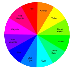
In order to select Best Colour Scheme for website, you need to understand basic ColourTheory. Colour theory is a practical mix of art and science that determines which Colours go well together. Isaac Newton plotted the Colour spectrum onto a circle in 1666 and established the Colour wheel. Because it depicts Colour relationships, the Colour wheel is the foundation of Colour theory.
Colour harmonies can be found using a Colour wheel and the rules of Colour combinations. Colour harmony refers to the combination of Colours that appear excellent together. In other words, Colour harmony is the term used to describe Colours that look good when joining together.
Isaac Newton created the Colour wheel in 1666 by plotting the Colour spectrum onto a circle. Because it depicts how Colours interact, the Colour wheel serves as the foundation of Colour theory. By applying the principles of Colour combination, you can utilize a Colour wheel to discover Colour harmonies. In order to obtain Colours that produce a beautiful impression, Colour combinations determine the relative placements of various hues.
Generally, there are two types of Colour wheel, i.e., RYB Model and RGB Model. In RYB Model, Red, Yellow and Blue colours are treated as Primary Colour. But in RGB Model, Red Green and Blue Colours are Primary Colour. Because it deals with blending light, like on a computer or TV screen, the RGB Color Wheel is made specifically for online and digital.

In RGB Colour wheel, we can divide Colours in to three main categories.
Primary Colours
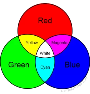
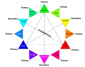
As discussed earlier, in RGB Colour wheel Red, Green and Blue are the primary Colours, and you will get pure white when you mix these Colours.
Secondary Colours
Secondary Colours are those Colours which are getting when you mix two prim

ary Colours. The secondary Colours are also three in number. When mix red, green and yellow will make, green and blue make Cyan Colour and Blue and Red Colour make Magenta Colour.
Tertiary Colour
When you mix one primary Colour and one secondary Colour you will get one Tertiary Colour. Like this you will get total six numbers of Tertiary Colours in RGB Colour wheel,
In the RGB Colour wheel these Colours are Orange, Chartreuse Green, Spring Green, Azure, Violet and Rose

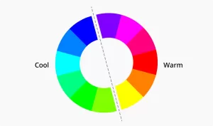
Colours in Colour wheel again divided into two based on their temperature nature. According to Colour psychology, different Colour temperatures evoke different feelings. Warm Colours are said to recall coziness and energy, while cool Colours are associated with serenity and isolation Warm Colours are the Colours from red through to yellow. Cool Colours are the Colours from blue to green and purple. Warm Colours are said to suggest warmth, like the sun. Cool recall coolness, like water.

The Colour wheel and the application of a few well-defined criteria are the simplest methods for choosing Colour harmonies or Colour combinations for your office furniture.
These principles are:
- Complementary
- Monochromatic
- Analogous
- Triadic
- Tetradic
Complementary
Two Colours on the exact opposite side of the Colour wheel are used in a complementary Colour scheme. This Colour scheme produces a vibrant, high-contrast Colour combination that pops. Red and green, yellow and purple, orange and blue, and green and magenta are frequently used complimentary Colour pairings. In sports, complementary Colour combinations are typically used by teams to express their boldness. Complementary Colour combinations are symbolic of being brave.
Monochromatic
Monochromatic Colour scheme uses one Colour as a base and different shades, tones, and tints of this base Colour. Monochromatic schemes usually consist of 3 to 7 variations in your one-Colour palette, made up of darker shades and lighter tints of the original Colour. But commonly using three Colours for a subtle and conservative Colour combination
Monochromatic design is perfect for creating visual cohesion. When choosing the Colour, you will start where anything in marketing starts – knowing your audience. You’ve got to choose a Colour that will resonate with the intended audience as well as communicate what your brand stands for.
Analogous
You must choose three Colours that are next to one another on the Colour wheel for this Colour scheme. Although this Colour scheme is adaptable, it may sometimes be too much. To balance an analogous Colour scheme, pick one dominating hue and utilize the others as accents. Select one dominating hue and utilize the rest as accents to balance an analogous Colour scheme.
Triadic
This Colour combination is more adaptable since it has a larger contrast but less than the complimentary Colour combination. Three hues that are equally spaced on the Colour wheel must be used. Bold and brilliant Colour palettes are the outcome of this mix.
Tetradic
Tetradic Colour schemes are striking and are at their finest when one Colour is the primary focus, and the others are employed as accents. For this combination, you must pick four hues that are equally spaced on the Colour wheel. The more Colours you have in your palette, the harder it is to balance them.
The following are the important features of various Colours:
Red – youth, power, importance
Black – sophistication, power, edginess
White – simplicity, cleanliness, virtue
Blue – safety,calm, Lighter Shades gives openness, Darker shares represents reliability.
Green – growth, stability, financial, environmental
Orange – uniqueness, friendliness, energy,
Yellow – antiquity, happiness, enthusiasm,
Purple – luxury, lighter shades forromance, darkershades for mystery
Grey – formality, neutrality, melancholy
Beige – traits of surrounding Colours
Ivory -simplicity, comfort, elegance
Website visitors are more likely to feel physically and emotionally at ease when your website that is both ergonomically designed and visually pleasant. It will be easier for workers to concentrate and perform better work if you create an environment where they may feel at ease, peaceful, and at home.

